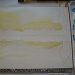
One of the things I like best about working in watercolor is the effect of glazes, the technique of superimposing the same or different color on another color. In applying glazes, it's essential that the background color is completely dry otherwise the colors will mix together. The beauty of watercolor is, in my view, the sparkle of its transparent colors. In creating "Lake Sunset," I applied a series of glazes beginning with a mixture of light cadmium yellow and Naples yellow in the sky and reflecting in the water. In Step 2, above, I added a light wash of permanent orange. When this was completely dry, I layed in the sky and water using Cerulean blue, as shown in Step 3. In Step 4, I added Alizarin Crimson to further light up the sky and lake and began creating the landscape of pine trees using a layer of Payne's Grey. I then darkened the trees with Indigo blue. The use of complementary colors -- blue and orange -- helps create contrast and atmosphere.


Write a comment
Adrianne Kierstead (Saturday, 04 February 2017 06:36)
Hi it's me, I am also visiting this website on a regular basis, this website is truly pleasant and the people are in fact sharing nice thoughts.